Eindhoven, De LUX Tower op Strijp-S
Country: NederlandCity: Eindhoven
Project name: De LUX Tower op Strijp-S
Type of building: New building
Type of construction: Residential
Contractor:
Stam + De Koning Bouw BV (EINDHOVEN)
Architect:
KENK archtecten (AMSTERDAM)
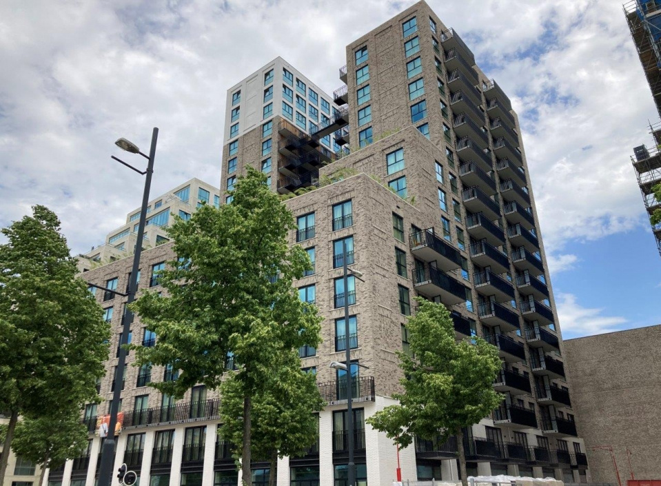
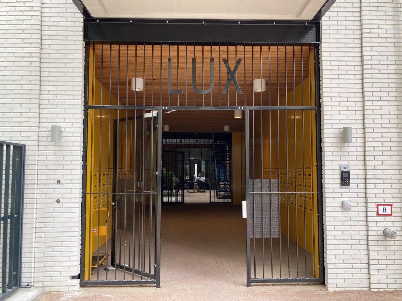
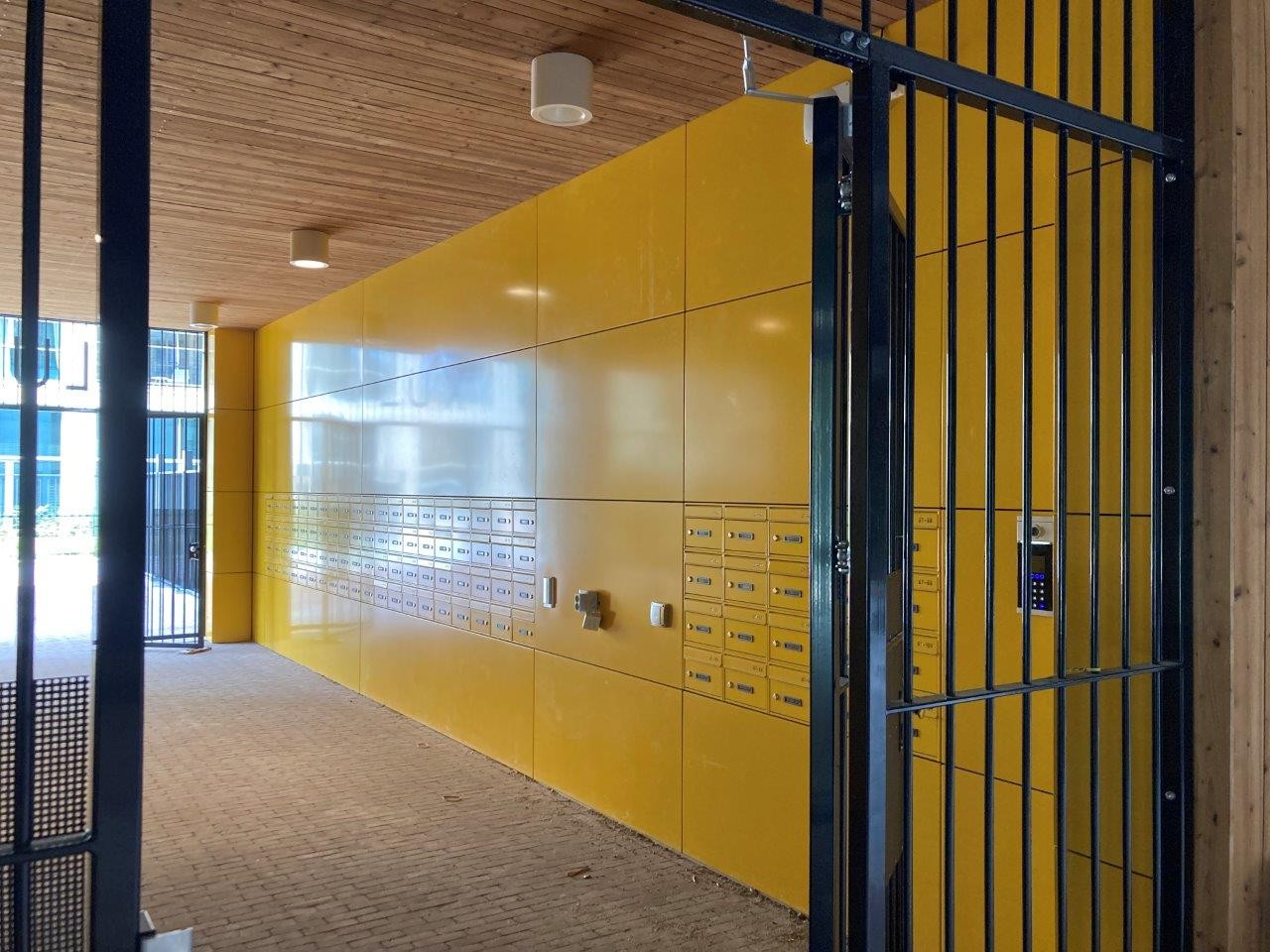
The LUX Tower at Strijp-S in Eindhoven is a design by Pim Köther and Ad Koedijk of KENK architects from Amsterdam. Iconic qualities are already being attributed to this project. Both high volumes and the view upwards evoke associations with a cathedral or with the Battersea Powerstation near London, known among music lovers from the Animals album cover by Pink Floyd. Materialization plays an important, yet useful role. This also applies to the aluminum detailing, as shown by the aluminum wall cover caps and aluminum water hammers. Less useful is the striking yellow aluminum plating, which is mounted against the walls of the room that provides access to the mail cabinets. The yellow aluminum gives this space an airy, sunny, even frivolous character.
Aluminum is a beautiful product
It is perhaps too early to call this a heritage building, but it certainly has some monumental features. Impressive, grand without being pompous, intentionally transparent and accessible, its industrial references fit perfectly in this historic location, contributing to the overall effect. The LUX Tower stands on Strijp-S in Eindhoven, on the site of the former Philips factory. It is part of the Railway Zone development.

Iconic qualities
The design by Pim Köther and Ad Koedijk from KENK architects in Amsterdam is highly evocative, with an iconic quality reminiscent of New York in the 1930s. ‘That is probably due to the open staircases between the two volumes’, says Pim Köther. ‘The brick used for the walls also plays a part. Personally I associate these two tall volumes and the view upwards between them with a cathedral or Battersea Power Station in London, best known from the Animals album cover by Pink Floyd.’
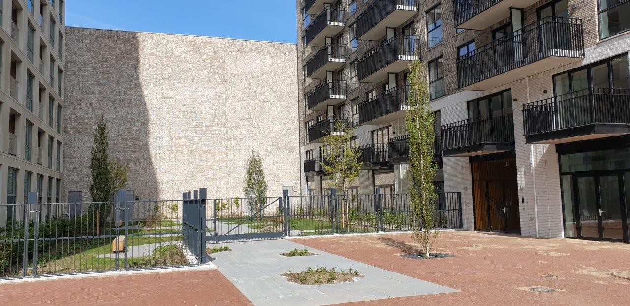
There is also a clear link to Paris, with a public “cour d'honneur” between the two volumes. A space of this kind was traditionally created between the two wings sweeping forwards from a main central block. The same feature can also be seen in the LUX Tower.
The individual collective
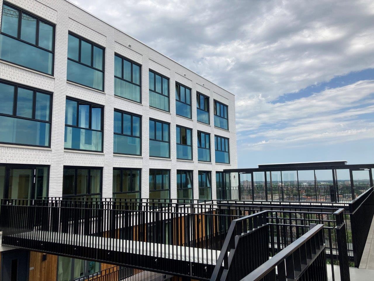
Returning to Eindhoven: one of the main principles behind the design of the 199 starter homes in the LUX Tower was the so-called “New Individual Collective”. The target group comprises young professionals, people at the beginning of their career, who tend to move on again after a few years. Pim Köther: ‘The design really fits for that target group. It’s not old fashioned. This is true urban architecture, with a focus on meeting people. This idea is encouraged by the spatial and functional layers which are graded from public to more private. These range from the publicly accessible “Cour d’Honneur” and a patio courtyard, via the roof terraces and a kind of study café, to individual homes.’ According to the architect, the open or covered areas invite young people to organise small-scale events.
Community
The building has a stepped structure, interrupted by roof terraces, with nineteen residential storeys. There is a large, shared roof terrace located on the seventh floor, with greenery that changes with the seasons. Köther: ‘Making room for “life” on the roof terraces creates a community atmosphere. This is particularly valued by those living in single person households.’
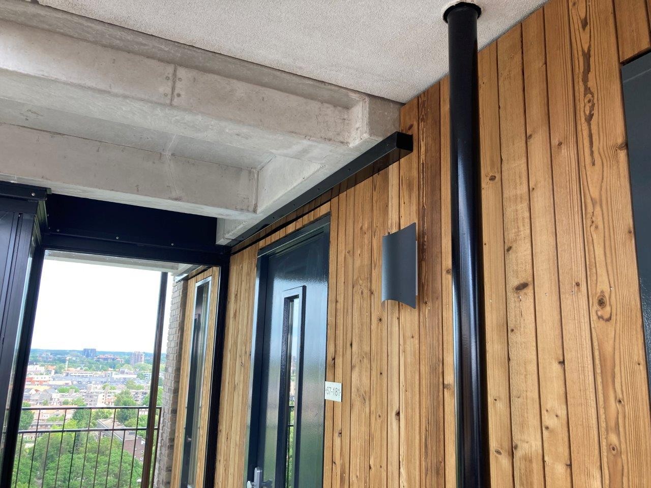
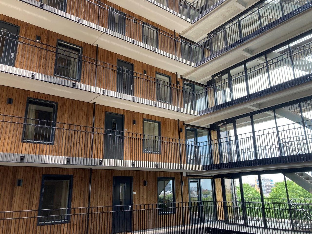
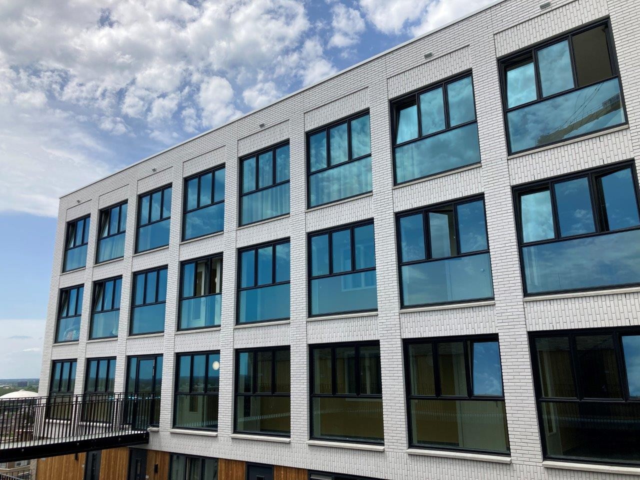
The architect sees the LUX Tower as having a bold image. It is big, tall and proud. ‘Together with the characteristic silhouette, it creates a link with the area’s industrial past. During our collaboration with the project supervisor, landscape architect Adriaan Geuze, we decided to break the symmetry of the towers. In the left-hand tower we therefore introduced a number of different types of housing in the top three storeys. The cladding on that part consists of white, glazed tiles with white grout, as a reference to the iconic Clock building on Strijp-S. Despite these asymmetrical nuances, LUX still has its own remarkable logic.’ A kind of asymmetry was also introduced in the way materials were selected. Interiors with a traditional wooden finish are alternated with natural brick and modern materials such as aluminium.

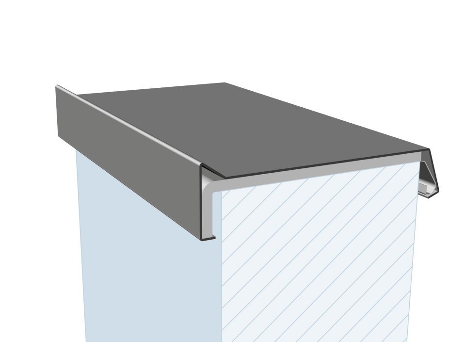
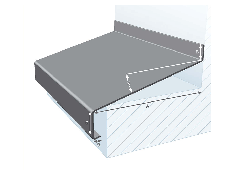
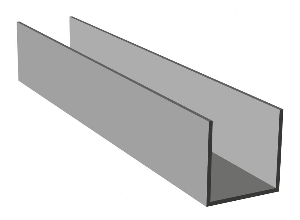
Aluminium detailing
The urban plinth is finished in the same white glazed masonry, while the remainder of the brickwork has a greyish tint. The materials used play an important and functional role in the design. ‘The same is true for the aluminium detailing’, says Köther. ‘Aluminium is a wonderful product: it works extremely well for detailing. What is more, it requires no maintenance.’
The use of yellow aluminium panelling on the walls of the area leading to the mailboxes, is less functional but very striking. This bright colour gives the area an airy, sunny and even playful character. Aluminium wall coping is also used as roof edge finishing on the seventeenth and nineteenth storeys. The walkway between the towers is clad with aluminium panelling, and aluminium window sills have been used.
Processed products
More information or questions?
Feel free to contact one of our specialists.- Address
- Maisdijk 7, 5704 RM Helmond (NL)