Amsterdam, Zeeburger Zilt
Country: NederlandCity: Amsterdam
Project name: Zeeburger Zilt
Type of building: Residential
Contractor:
BAM Wonen Urban Up (AMSTERDAM ZUIDOOST)
Architect:
Steenhuis Bukman architecten BV (DELFT)
The Zeeburger Zilt plan consists of four buildings: a residential tower, two residential blocks and a row of townhouses.
THE UNIVERSALITY OF ALUMINIUM DETAILING

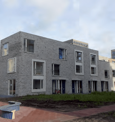
Zeeburger Zilt on Amsterdam’s Zeeburgereiland was designed by Marc Bukman of Steenhuis Bukman Architects in Delft. It is actually four different designs, each with its own dynamics - or typology, as the architect calls it - but with a common signature. The plan consists of four buildings: a residential tower, two square residential blocks and a row of townhouses.
No feeling of massiveness
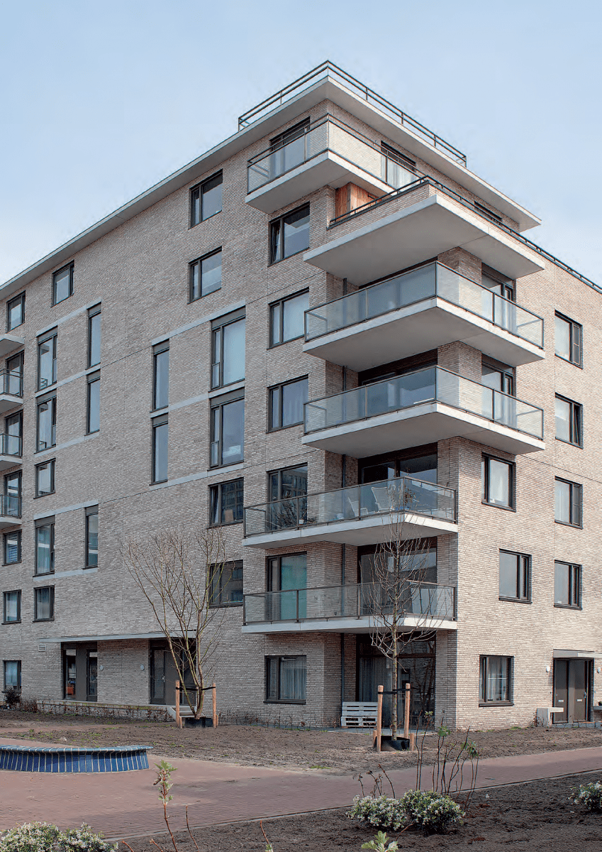
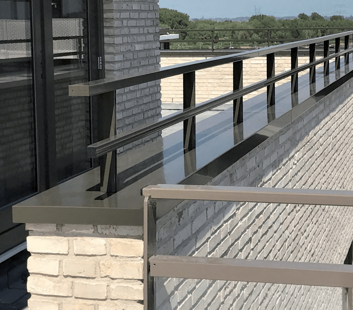
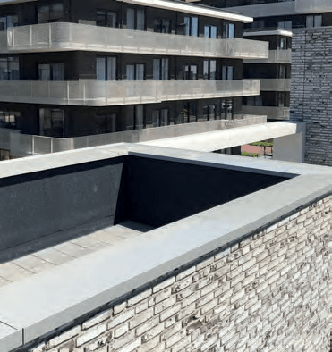
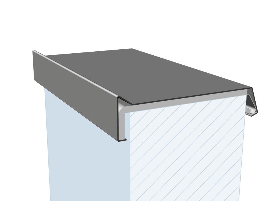
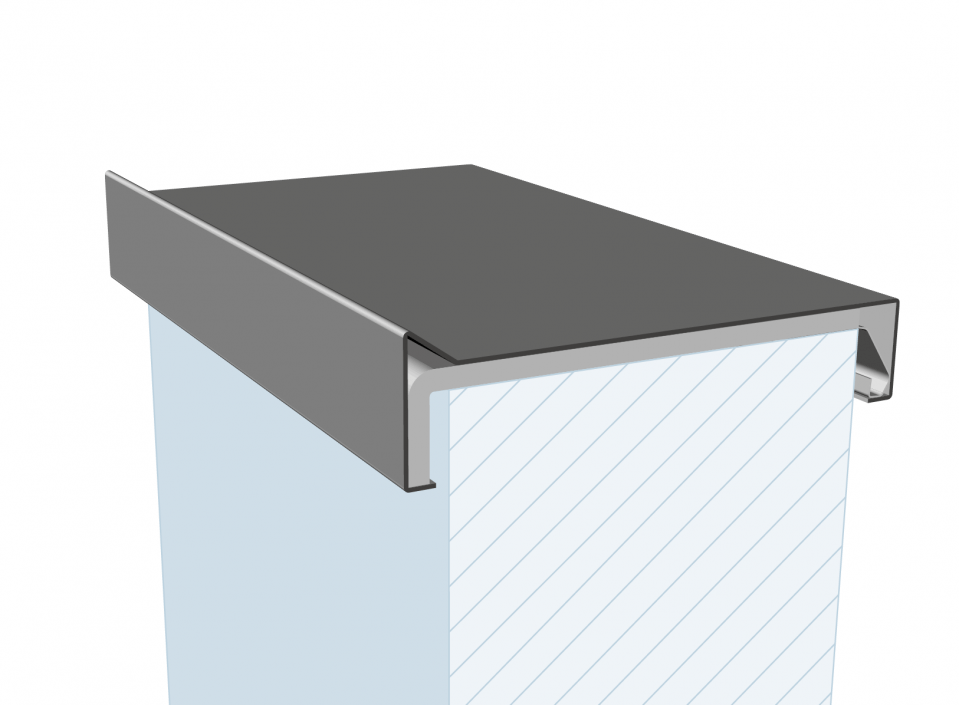
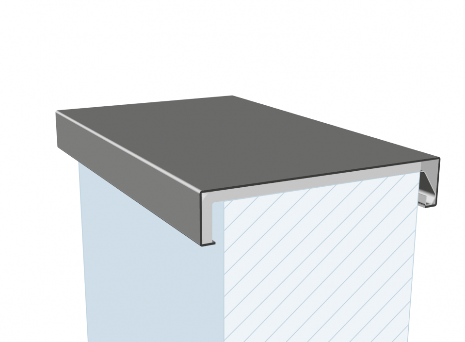
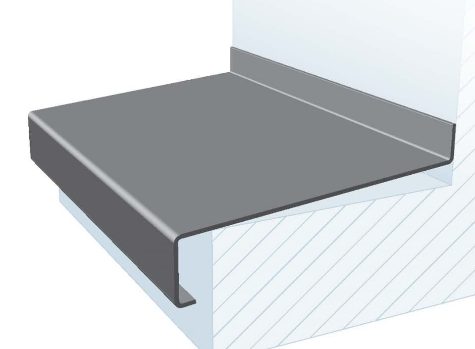
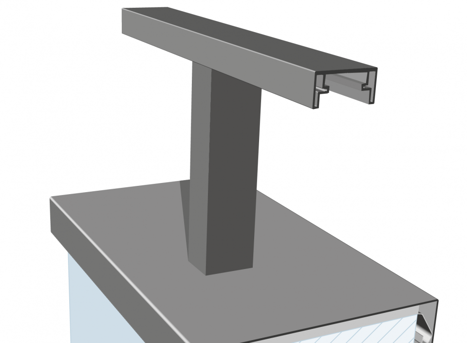
The residential tower, with its unexpectedly large six-metre entrance hall, is a universal design and consists of six storeys. Penthouses are located on the top floors offering a magnificent view of the IJ. Marc Bukman: “It is a substantial volume, but any sense of massiveness is dispelled thanks to the light colour schemes.” The light brick with its white mortar, combined with the white prefabricated concrete slabs of the balconies, give the building a light-footed accent. The residential tower is somewhat sculptural thanks to the balconies, which are staggered in relation to each other. The balconies on the top two floors are fitted with aluminium wall coping systems and balustrade systems. The roof of these penthouses is detailed with aluminium overhang cladding. The windows are also staggered in relation to each other at various points in the building.
Aluminium frames
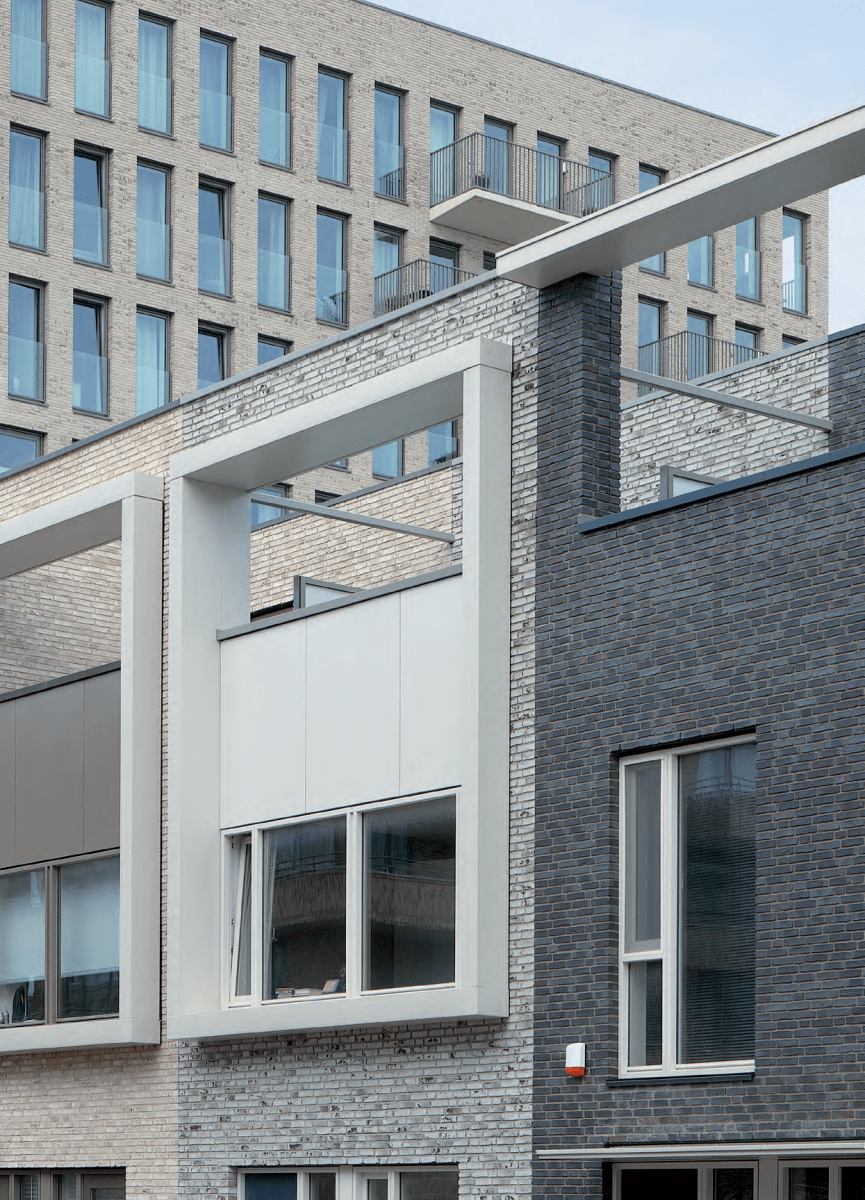
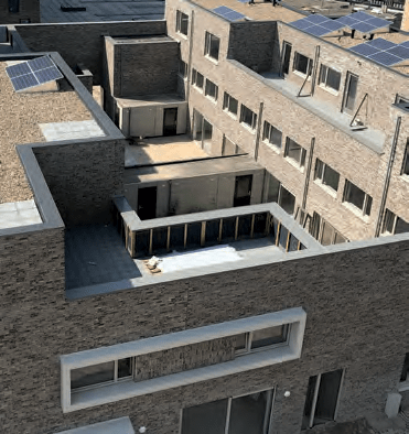
Like the residential tower, the two square residential blocks have universal designs. Without beginning or end. These squares consist of single-family dwellings and have two to four storeys. The combination of materials - brick, aluminium and concrete - also plays a role here. The use of robust aluminium frames which are integrated into the buildings like picture frames - with or without content - is striking. Large windows are interspersed with person-sized windows, some of which have aluminium sills. The squares also feature idiosyncratic elements like a viewing hole in the façade, irregular window division and the aforementioned empty aluminium frames. “It is composed untidiness,” says Marc Bukman. This is with a sense of understatement, because it is exactly this intelligent asymmetry in the layout that makes the buildings so distinctive. Both residential blocks have common features (such as the aluminium frames) but they also differ from each other. Bukman: “You can see these differences in the design of course, but also in the use of materials, the choice of bricks, colour nuances and masonry dressings.”
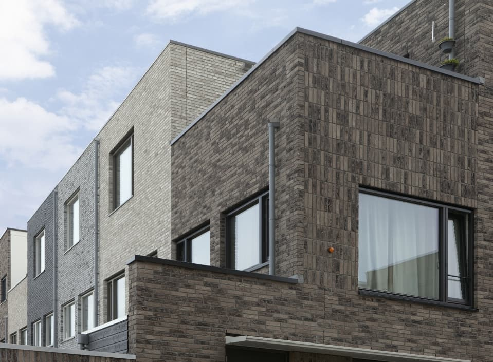
In contrast to the residential tower and the squares, the row of townhouses is not universal and has a beginning and an end. It is up to the onlooker to decide which side is the beginning or the end.
Each of the houses has its own character. Marc Bukman: “Each individual building has a unique façade and use of colour. Light tints alternate with darker shades of brown and black brick. Here too, in addition to aluminium sills and wall coping systems, the nice fat aluminium frames recur. That is also an advantage of detailing with aluminium. You can do anything with it: from slender and slim to sturdy and robust.”

More information or questions?
Feel free to contact one of our specialists.- Address
- Maisdijk 7, 5704 RM Helmond (NL)